|
|
|
|
|

|
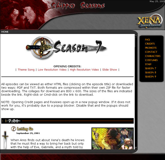
Since this site began it's gone through several different designs, each of them getting progressively better--(at least, I feel they have) I decided to dig up the past layouts (I'm so glad I still had them saved on my computer) to show you what I've come up with over the years just to compare what this site was to what it is now. The layouts are shown from oldest to newest.
Enjoy looking through this archive of layouts for the Shipper Seasons website!
|
|

|
|
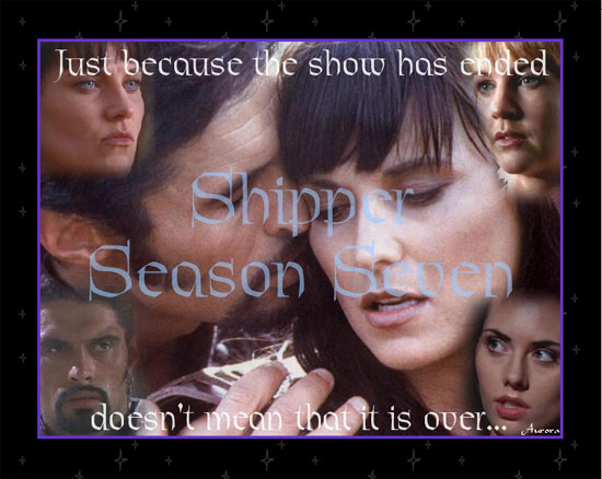
ONLINE: 9/18/01 - 3/6/03
DESIGN PROGRAM: Notepad, Adobe PhotoDelux
CREDITS: Aurora, Dixie and Maureen
LAYOUT: Tables
SPECIAL FEATURES: Javascript
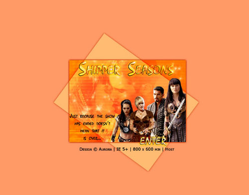
I owe a bit of credit to Dixie for the inspiration of this layout. When the idea for the Shipper Seasons (just called Shipper Season Seven back then, because we hadn't anticipated continuing on after one season) was still in it's early stages, I had created a free web account with Yahoo! Geocities. It was a nice site for a web design novice, which I was, and it offered a nice amount of space for the site (20 MB). I first used the Yahoo PageBuilder to build the site because I did not know HTML very well at the time. (unfortunately, I do not have this design anymore--but it is similar to the one above)
But after putting the site online after having created a few pages, there were some problems with viewing the site, with some of the tables not flowing correctly and the site just wasn't working right. It had to do with the fact that I didn't have complete control of the way the code was written because the PageBuilder program wrote it for me--and I didn't know enough about coding to fix the problems. That's when Dixie stepped in. She offered to code the site (all of 5 pages at the time: Episodes, Bards, Banners, Designs, and Links) and use the design idea that I had created with the PageBuilder. I then took what she had created, tweaked it a little (and learned more about coding while I fiddled with it), added the content I needed to and the site was ready. Dixie got me started on the way.
Maureen created the buttons for the links and also the "Shipper Seasons" image at the top of the main page. Dixie created the headers for the pages and the episodes (i.e. "Shipper Season 7")
I'm not really sure why I chose purple for the site design. I mean, purple isn't really a color you'd think to associate with Xena and Ares. ;-) I think it came from one of the official Xena logos, actually, where the colors for the words "Xena" are purple. I based the color scheme around that, I believe.
The site was on the web for almost a year and a half. In that time, it went through a few slight changes. One of those changes was that I transferred it from Geocities to Angelfire. The reason for this was because on Geocities, it didn't allow enough bandwidth to accommodate the traffic the site was getting and the site was frequently down for two hours at a time because it was penalized for excessive bandwidth. I didn't like this, so I moved it to Angelfire and I didn't have a problem there (or at least a notable problem). Other than this move, the basic look of it stayed the same.
Navigation was in the form up buttons on the main page and simple text links on every other subpage. The only javascript on the site was used for the slideshow of the opening credits.
|
|
|

|
|
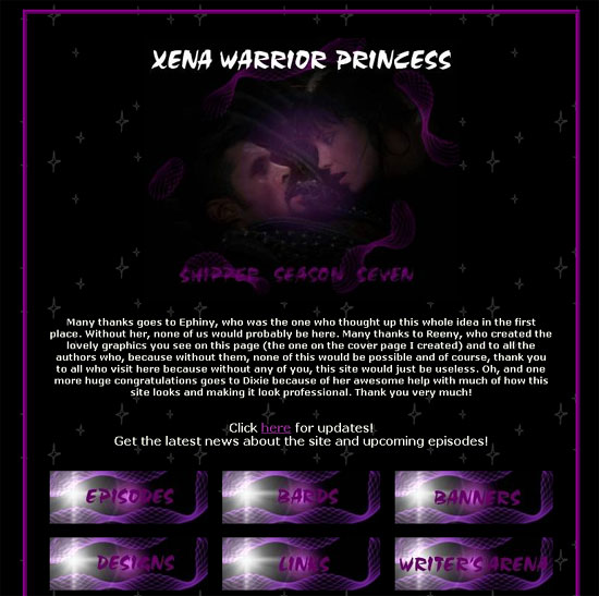
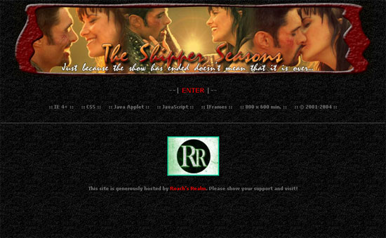
ONLINE: 3/6/03 - 12/31/04
DESIGN PROGRAM: Notepad, Adobe PhotoDelux
CREDITS: Aurora
LAYOUT: Tables
SPECIAL FEATURES: Java Applet, Javascript, IFrame
I created this design while on Spring Break from collage. I was taking a class on HTML and I was inspired to create a new design for the site. After all, I had been living with the current design for a year and a half and I felt it was time for a change.
Not only did I want to change the site design, but I considered changing the color scheme, too. I was tired of the purple and wanted to make it something that was more fitting for Xena and Ares. So I chose reds, oranges, yellows, black, white and assorted grays. I think it turned out really well and was a definite improvement from the first layout. I had become much better at coding than I was before and I strived to make a very interesting and functional design. I love the deep red color of this layout. I think it really stands out against the black background and fits perfectly for Xena and Ares.
A Java Applet at the top of each page served as the navigation bar and it was very functional. Javascript was used for the pulldown forms menu on the main page, used for navigation. IFrames were used in this layout on the reviews page to allow the links for the episode reviews to be on the left side of the page and then, when clicked, the reviews would open up in a window--the IFrame--on the right side of the page. It was very handy.
While this design was in use, I also made a very important move to another host in July of 2004. I was getting very tired of all the ads that Angelfire was putting on my pages (it started out just being popups but then they changed their rules and made it popups and on-page banners). I was offered to transfer the site to Roach's Realm. Roach was very generous in offering her server to us to put the site on (she owns one of her own) and so I took up the offer. The site was transferred, there is a lot of bandwidth and space for this site to use and the best part is, no ads. Yea!
|
|
|

|
|
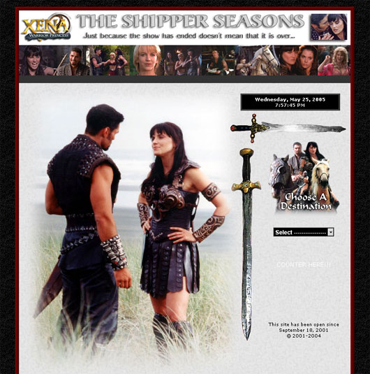
ONLINE: 12/31/04 - 6/13/05
DESIGN PROGRAM: Notepad, Photoshop, ImageReady
CREDITS: Aurora
LAYOUT: Frames, Tables
SPECIAL FEATURES: Javascript
This layout was created as a result of a web design class I was taking in the fall of 2004. I created it for a website that I created for the class--and I liked it so much that I decided to use it for this site. It uses the same colors as the previous layout but I decided to create it in frames this time, so that the entire layout would expand for the viewer, depending on the resolution of their monitor.
This was also the first layout that I created (or had help creating) using Photoshop and ImageReady. I had bought those programs a few months before and I was able to use them to help me create the website. I used the slicing in ImageReady for the first time and I was very happy with the results. I was very surprised that the images of the frames fit so well together and the center of the site where the content is works just like I had envisioned it--where the content would scroll and the right, top and bottom frames would enclose it. I love how it turned out.
|
|
|

|
|
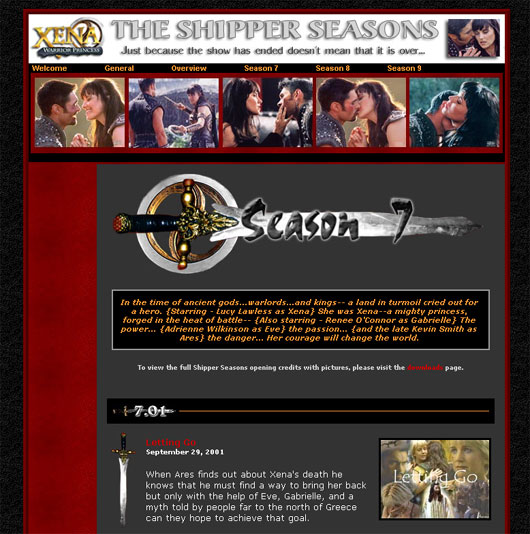
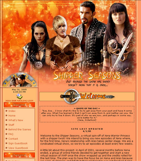
VERSION TITLE/THEME: Sunshine Sparkle
ONLINE: 6/13/05 - 12/12/05
DESIGN PROGRAM: Notepad, Photoshop, ImageReady
CREDITS: Aurora
LAYOUT: Tables, Frames
SPECIAL FEATURES: Javascript
This design is by far, my most favorite of all. I would say it's the most image-driven layout that I've done. I was trying to be bold, not only with the design (doing something I'd never done before) but also, drastically changing the colors that drive the site. I don't know where I came up with using these colors, but I wanted to create something that was very warm and sunny. I wanted something very different from what I had previously been doing, using only dark colors like black and gray to dominate the layout.
As you can see, I have chosen to use peach for the background, and a combination of reds, oranges, and yellows. I love how it has turned out and am very proud of it.
I created the entire layout in Photoshop and then sliced it up and saved each image. It made it a lot easier for me to build the page once I knew exactly what images would go where and how big they were before I even started. I think the layout is very balanced, with the colors and design that is present at the top of the page is repeated at the bottom as well.
One of the things that I was aiming for when I created this layout was that I wanted to incorporate the four main characters of the show--Xena, Gabrielle, Ares and Eve--as a focus of the layout. So I put pictures of them at the top of the layout, with both Gabrielle and Eve in their new outfits. Of course, I can't forget that this is the "Shipper" Seasons, so I have a montage of intimate images between Xena and Ares faded into the background of the top banner, coupled with glittering stars, lines and a feeling of a glow. There is even an animated gif that twinkles on the logo.
It turned out very well, if I do say so myself. :-)
|
|
|

|
|
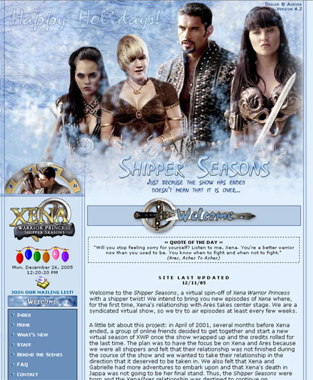
VERSION TITLE/THEME: Solstice Spirit
ONLINE: 12/12/05 - 2/12/06
DESIGN PROGRAM: Notepad, Photoshop, ImageReady
CREDITS: Aurora
LAYOUT: Tables, Frames
SPECIAL FEATURES: Javascript
I decided to slightly alter the version 4 layout to reflect the holidays. So that's all this really is. I chose some light blues to reflect snow and ice in the spirit of Solistice.
|
|
|

|
|
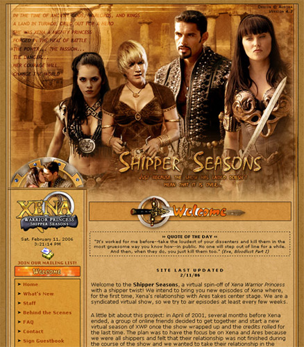
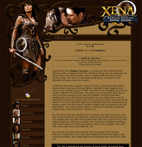
VERSION TITLE/THEME: Ancient Times
ONLINE: 2/12/06 - 8/1/06
DESIGN PROGRAM: Notepad, Photoshop, ImageReady
CREDITS: Aurora
LAYOUT: Tables, Frames
SPECIAL FEATURES: Javascript
You can tell I like this layout, huh? Well, I was in for a change for this site for the new year and all (and the fact that the other layout had been around for 6 months). So since I like the basic layout and I haven't felt like making something completely new, I thought I would just change the color scheme and the general "feel" of the site. I included some images of Greek columns that can be seen in the background behind the characters and I decided to include the words from the opening credits of the show into the layout as well. This is also the first layout that was used when I finally go the site it's own domain and host: www.shipperseasons.com.
|
|
|

|
|
VERSION TITLE/THEME: Xena's Armor
ONLINE: 8/1/06 - 7/7/07
DESIGN PROGRAM: Notepad, Photoshop
CREDITS: Aurora
LAYOUT: Tables, Frames
SPECIAL FEATURES: Javascript
The idea for this layout came about in my head because I was thinking about how much I love the look of Xena's armor, all the curves and patterns; it's so distinctively "Xena". But, it also has a Celtic look to it since it was inspired by M'Lila's outfit from "Destiny". And actually, the curly symbol you can see on the section headers on some of the pages and on the navigation menu is M'Lila's necklace, so she was part of the inspiration of this layout, too.
So, I thought it would be interesting to do a layout focused on the patterns of her armor. Sometimes, it looks a little more like tree branches, but I think (I hope) that it's clear that the design is supposed to represent the patterns of Xena's armor, particularly her armbands and gauntlets.
I also wanted to bring the main focus on Xena in this layout since it is a continuation of her show. Of course, I had to include a picture of Xena and Ares since that is an important focus of our seasons--but Xena is the main theme of this layout. I didn't want to forget about the important supporting characters of the seasons, so I included their images on each one of the navigation sections.
I really adore the browns of this layout, too. It was all inspired by Xena's outfit and it became a lot prettier than I had envisioned. I'm very happy with how it was able to creatively grow from an idea into a nice looking finished product. I really like how it turned out, simple yet elegant.
|
|
|

|
|
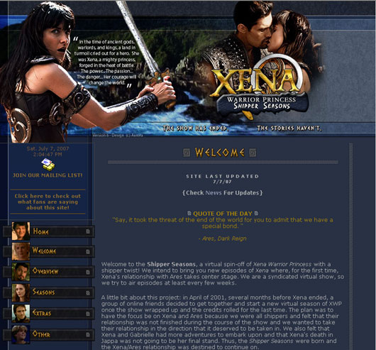
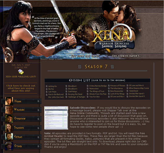
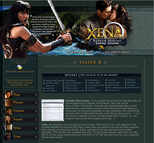
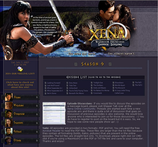
ONLINE: 7/7/07 - 10/2/20
DESIGN PROGRAM: Notepad, Photoshop
CREDITS: Aurora
LAYOUT: Tables, Frames
SPECIAL FEATURES: Javascript
Well, I think I'm beginning to see a pattern here. Every six months or so (in this case, almost a year), I get the urge to create a new layout. :-D Actually, I decided that I wanted to create a new layout because we are doing a season 10 and I think it would be nice to have one great layout before the seasons are over. So, this layout was born from that concept.
This layout took a little over a month to complete (I started it in late May '07) but it wasn't really that difficult, I just kept changing things after the initial layout was complete.
I'm not really sure what I would call the theme of this layout. The colors are basically based on the colors from the Shipper Seasons logo (blue/grays, yellows, oranges) and I wanted to give the layout a somewhat Greek look to it, hence the greek symbol. I wanted to make the top simple and include Xena, Xena and Ares and a nice background of the first image that you see in the opening credits--a camera panning over rocky cliffs while that great musical instrument plays. I also wanted to include the opening credits in the layout itself as well.
One of the main ideas I had for this layout was to create a layout that filled the entire browser screen, regardless if you had a higher resolution on your monitor or not. As you can see, the layout does flow continusouly from one end of the browser window to the other and the only noticable break is the small vertical greek symbols dividing the edge of the content layout from the rest of the layout. I think it has turned out really well.
The other change that I wanted to make--since this is the last season and possibly the last major layout--is that I wanted each season page: 7, 8, 9, and 10 to have the same layout but in a different color. This is something that I have never done before and I wanted to try it out. So, you will see that on each season page, the layout is exactly the same but the colors are differents: a redish brown from season 7, a green for season 8, a purple for season 9, and a yellowish brown from season 10. I also chose to adjust the episdoe pages slightly as you can see that the navigation menu has changed.
I am very happy with how this layout has turned out and I hope that all of you enjoy it as much as I do!
|
|
|

|
|
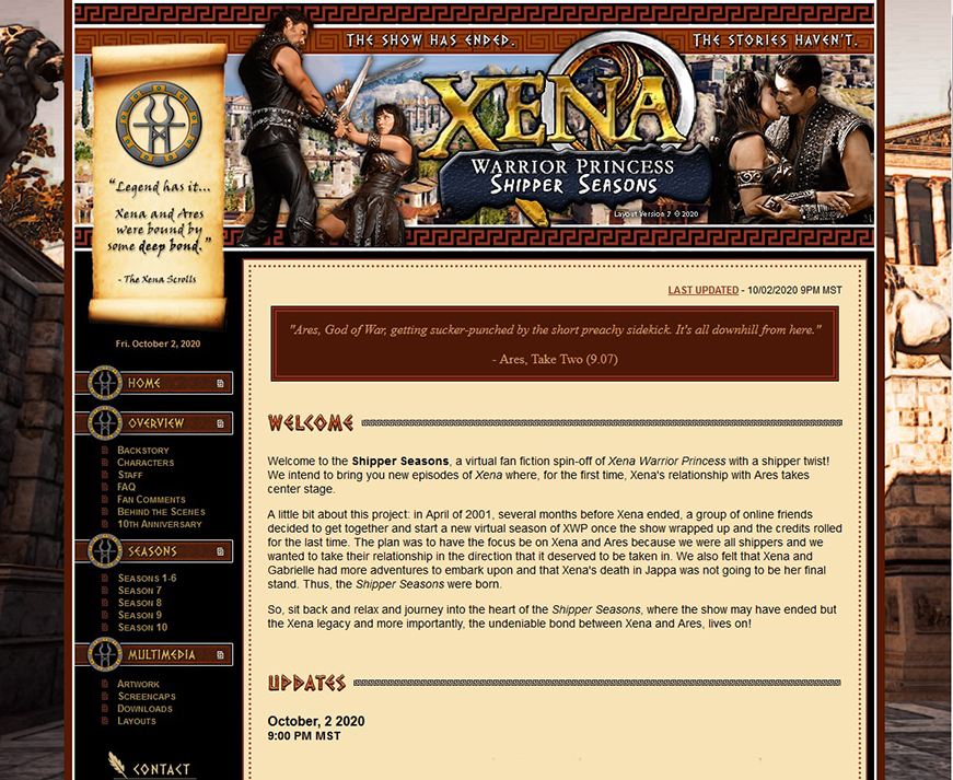
ONLINE: 10/2/20 - present
DESIGN PROGRAM: Notepad, Illustrator, Photoshop
CREDITS: Aurora
LAYOUT: Tables, Frames
SPECIAL FEATURES: Javascript
It's been more than 10 years (holy moly). The Shipper Seasons has always been a part of me, at the back of my mind, but I think it has not been more on my mind in recent years than in 2020. The year has been crazy for many people, and one of the things I have found that helps me cope is reliving things that I loved, and the noestalgia of it all. It's also the 25th anniversay year of Xena: Warrior Princess and so I have been reliving all the good times and remembering all of what the show has meant to me. A big part of that is Xena and Ares. I've been delving deeper in the Shipper Seasons than I have been in recent years, wanting to write the remaining stories I have been sitting on for years, print out the episodes so I have them on my bookshelf to read and admire whenever I want, and to make a new layout for this website.
I have been deep into my obsession with Ancient Greece recenlty. It just hit me and I've been wanting to do nothing but read and play games and watch shows that are set in the Ancient Greek and Roman time period. So I wanted to bring that love to this website.
I wanted the focus mainly on Xena and Ares. The background is a screenshot taken from Assassins Creed: Odyssey, a great game set in Ancient Greece (the only reason I got it). It's a shot of Amphipolis. I used a shot of Athens as the background for the header of the pages, and the rest I wanted to do something simple inspired by Greek pottery with the terracota, tan, black and white.
|
|
|
|
|
|
 |
 |
| |